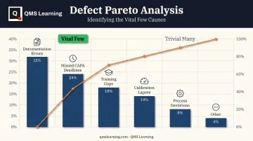
That's where the Pareto chart comes in. ASQ classifies it as one of the seven basic quality tools, built on a simple premise: a small number of causes typically drive most of the effect, what quality pioneer Joseph Juran famously framed as the "vital few" versus the "trivial many."
But a Pareto chart's value swings wildly depending on how you categorize, measure, and interpret the data behind it. Build it carelessly, and you can send an entire team chasing the wrong root cause for weeks.
This article covers when to reach for a Pareto chart, the exact steps to build one, what needs to be in place before you start, the mistakes that quietly wreck results, and how it stacks up against 5 Whys, Fishbone diagrams, and FMEA.
Key Takeaways
- Pareto charts rank causes by frequency, cost, or downtime to surface the "vital few" behind most defects
- They prioritize problems — they don't diagnose them; pair with 5 Whys, Fishbone, or FMEA next
- Accuracy hinges on consistent categories and a stable data window, not the chart itself
- Most failures stem from mixed categories, stale data, or samples too thin to show real variation
- Treat Pareto as the first step in structured RCA, not a standalone fix
How to Conduct Root Cause Analysis Using a Pareto Chart
A Pareto chart is only as good as the process that feeds it. Here's the sequence that keeps the output trustworthy.
Step 1: Define the Problem and Collect the Data
Start with a specific problem statement, not a vague one. "Reduce scrap" isn't a starting point. "Categorize scrap causes on the CNC line for Q1" is.
Before collecting a single data point, decide:
- The measurement type — frequency (defect count), cost, downtime, or another unit that matches the problem
- The scope — which process step, product line, or shift you're analyzing
- The collection window — long enough to reflect genuine variation, not a single bad shift
A one-day sample after an unusual event will mislead you. A window spanning a process change will blur two different realities together.
Step 2: Categorize the Data and Calculate Cumulative Percentages
Inconsistent categorization is the single biggest driver of misleading Pareto charts. If "packaging defect" and "carton flap damage" both exist as separate categories when they're really the same issue, your rankings will lie to you.
- Define categories narrowly enough for this one analysis, and apply them the same way across every observation
- Group rare, low-impact items into an "Other" bucket — but watch that bucket. If it grows too large, your categories are probably too fragmented to be useful
- Sort every category from highest to lowest impact, then calculate what percentage each contributes to the total
Once sorted, calculate the cumulative percentage running total. This is what tells you how quickly a handful of categories account for the bulk of the problem.
Step 3: Build the Chart and Identify the Vital Few
Plot your sorted categories as bars against the primary (left) axis, measured in frequency, cost, or whatever unit you chose. Then plot the cumulative percentage as a line against a secondary (right) axis, climbing toward 100%.
Look for where that line starts to flatten. That bend is your signal: the categories before it are worth attacking first; everything after is lower priority for now.
Common tools for building this:
| Tool | Pareto capability |
|---|---|
| Excel | Native Pareto chart type under Insert > Statistic Chart |
| Minitab | Dedicated Pareto tool, plus a weighted version for severity or cost |
| Google Sheets | No built-in Pareto type — build manually with sorted data, a combo chart, and a second axis |
| Power BI | No dedicated Pareto command — build with a combo visual and a running-total measure |
| QMS platform | Can auto-generate directly from logged defect or nonconformance data |
Step 4: Confirm the Root Cause and Move to Corrective Action
Here's the part teams skip: a Pareto chart tells you where to look, not why the problem happens. The top category on your chart is a target, not a conclusion. It still needs a deeper method, such as 5-Why or a Fishbone diagram, to confirm what's actually driving it.
That handoff is where QMS Learning's AI Workbench fits. Give it the prioritized Pareto category and it routes you to the right follow-up method (5-Why, FMEA, or CAPA) based on whether the issue looks systemic or isolated. It then drafts the audit-ready artifact so the next step doesn't depend on whoever is free that afternoon.
Whatever method confirms the cause, document the finding and corrective action in a format that survives audit or registrar review. A Slack message or internal note that disappears in six months will not.
When Should You Use a Pareto Chart for Root Cause Analysis?
A Pareto chart isn't always the right first move. It earns its place when you have multiple discrete, countable causes competing for attention.
Typical use cases:
- Supplier defect tracking across multiple part numbers or lots
- Customer complaint categorization by root type
- Failure-mode or downtime analysis across equipment or lines
- Scrap and rework reduction efforts
A 2024 Quality Magazine analysis illustrates the value of drilling down: a packaging line breakdown found that Line 3 generated 53.6% of total defects, and within that line, folded flaps accounted for 39.5% of its defects. That's a two-level Pareto pointing to one specific, fixable target instead of a vague plant-wide defect problem.
Skip the Pareto when the data won't support it:
- One cause is already obvious and dominant
- Causes aren't easily countable or categorized
- The problem is a one-off or novel issue better suited to a Fishbone or 5 Whys
What You Need Before Building a Pareto Chart for RCA
The chart itself is the easy part. The inputs are what determine whether it reveals real priorities or produces confident-looking noise.
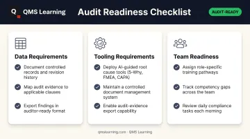
Data requirements:
- Consistent category definitions applied the same way by everyone recording data
- A sample size large enough to reflect actual process behavior, not one lucky or unlucky run
- A defined time period stable enough that you're not mixing pre- and post-change data
Tooling requirements: A spreadsheet or QMS platform capable of dual-axis charting (bars plus a cumulative percentage line).
Team readiness: Staff who can separate causal factors from surface symptoms, so categories reflect real distinctions—not whatever complaint language a customer used.
Skip any of these, and the chart will still render — it just won't mean much.
Common Mistakes When Using Pareto Charts for Root Cause Analysis
Most Pareto chart failures are judgment errors made before the chart is even built.
| Mistake | Fix |
|---|---|
| Treating the chart as the final answer | Always follow the top category with a deeper RCA method before closing the finding |
| Combining dissimilar defects into one broad category | Audit category definitions before charting so bars stay genuinely comparable |
| Using outdated or too-small data samples | Set a minimum sample threshold and refresh on a fixed review cadence |
| Deprioritizing low-frequency but high-severity or compliance-risk categories | Cross-check Pareto rankings against severity and regulatory risk before finalizing priorities |
| Misreading a flat, even chart as "no clear priority" | Check whether categories are too fragmented and need regrouping into fewer, meaningful buckets |
Don't force the 80/20 split onto your data. Quality Digest's history of the tool notes that reading a strict 80%/20% ratio from a small category set or handful of observations can be genuinely misleading. The pattern of uneven impact is real. The exact ratio isn't a law.
Pareto Chart vs. Other Root Cause Analysis Tools
A Pareto chart prioritizes which problem to attack first. It doesn't diagnose why that problem happens, which is exactly why it's almost always paired with a second method.
| Tool | Best used for | Limitation |
|---|---|---|
| Pareto Chart | Ranking known, quantifiable causes to decide where to focus | Doesn't explain the causal mechanism on its own |
| 5 Whys | Single, straightforward problems needing a fast answer | Quality depends heavily on the facilitator's line of questioning |
| Fishbone Diagram | Root cause completely unknown, multiple factors likely interacting | Thorough, but doesn't rank which cause matters most |
| FMEA | Anticipating failure modes before they happen | Rigorous, but data- and time-intensive |
Picking the right tool is its own skill. Under deadline pressure, that call usually falls to the junior engineer, not the veteran auditor.
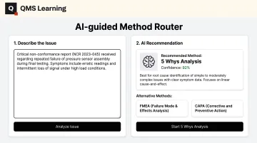
QMS Learning's AI-guided Method Router closes that gap. It walks teams through the 10 most common compliance and RCA plays (5 Whys, FMEA, CAPA, gap analysis, and others), flags whether an issue looks like a process gap, isolated incident, or supplier problem, and recommends the right fit.
Frequently Asked Questions
What is the 80/20 rule in Pareto charts?
It's shorthand for the idea that roughly 20% of causes typically drive about 80% of the effect. The exact ratio varies by context, but the underlying pattern of uneven impact holds consistently.
How do you analyze a Pareto chart?
Read the bars in descending order alongside the cumulative percentage line. Focus improvement effort where that line rises steeply, before it starts to flatten out.
What are the 5 P's of root cause analysis?
A common framework structures cause investigation around Parts, People, Process, Procedures/Paperwork, and Plant/Place. It's typically used alongside tools like Pareto or Fishbone rather than as a standalone method.
What's the difference between a Pareto chart and a Fishbone diagram?
A Pareto chart ranks known, quantifiable causes by impact. A Fishbone diagram brainstorms and organizes unknown or qualitative causes into categories for further investigation.
Can a Pareto chart be used alone for root cause analysis?
No. It identifies where to focus, not the underlying cause. Follow it with a diagnostic method like 5 Whys or a Fishbone diagram to confirm what's actually driving the problem.
What software can I use to create a Pareto chart?
Excel and Minitab both include native Pareto chart tools. Google Sheets and Power BI can build one manually using sorted data and a combo chart. Some QMS platforms auto-generate them directly from defect or nonconformance records.